Background
Metra is the rail system that operates and oversees a 546-mile commuter railroad system in the Chicagoland area and suburbs. A division of Chicago’s Regional Transportation Authority, the Metra rail system was created in 1983 as a reorganization of the RTA following a succession of financial crises. With over 80 million annual riders, 241 stations and 11 rail lines, Metra is the largest rail system outside of New York City (via American Public Transit Association, Metra, and Encyclopedia of Chicago).
Design Challenge
Many still rely on trains to commute in and out of the city, but a new age requires legacy companies stay up to date and remain a strong presence online to help remain present to both current and future riders. Boarding trains can be confusing enough, especially when dealing with delays and abstract times- this interface demands clarity and ease of use to help ensure everyone gets where they are going.
PROBLEM
Rail travel hasn’t innovated comparatively to the market and still has users rely on juggling multiple separate services for simple use of the trains.
Solution
Identify pain points with the existing system and craft a cohesive mobile app that aids in purchasing tickets, informs the user of relevant alerts, and makes tracking a train / scanning a ticket a more streamlined experience.
User Research
Research Questions
I began my research by crowdsourcing opinions on what the largest problems are. I formulated my questions to survey the public to identify main pain points with the existing website and mobile apps. The goal of questions asked was to examine common patterns, find actions that didn’t make sense, and gain an overall consensus on what could be improved.

Research Methodology
To gather this information, I created a poll that helped collect 127 responses cited other Train rail system sites and apps, such as Chicago’s CTA and New York’s Amtrak to figure out where Metra was lacking and what could be added to produce a better experience for the user. These polls were shared on reddit in r/ChicagoSubrubs, r/Illinois, and r/Chicago.
This survey asked participants:
Where do you most often purchase tickets from?
Where do you check Train schedules?
What’s your primary purpose of using the Metra website?
Do you use either the Metra app (onTime) or Ventra app?
How often do you use the rail system?
What type of ticket do you typically purchase?
What is something you expect from these mobile apps?
When asked what should be expected from the mobile app, the common themes for improvement were:

Participants were eager to share their criticism of the system, and were helpful in pointing me to a huge disparity between actions:
Where do you check train schedules?
Where do you most often buy tickets from?
70% of users checked train schedules on the Metra website while 59% bought tickets through the Ventra mobile app.
Both of these actions should be happening in the same place.
It became apparent that this, among other issues, made these apps badly in need of a redesign. After collecting this data, I took to figuring out what features were feasible to implement and which ones weren’t because of technical limitations.
Persona
After conducting these surveys, I found multiple areas where an app could address these pain points. Therefore, I created three personas that reflected the feelings and dispositions of those surveyed. Setting up my target audience for the app, I wanted to create perspectives of both those familiar with taking the rail system and those newer to it; many of these personas are modeled after friends of mine that reflect similar struggles.

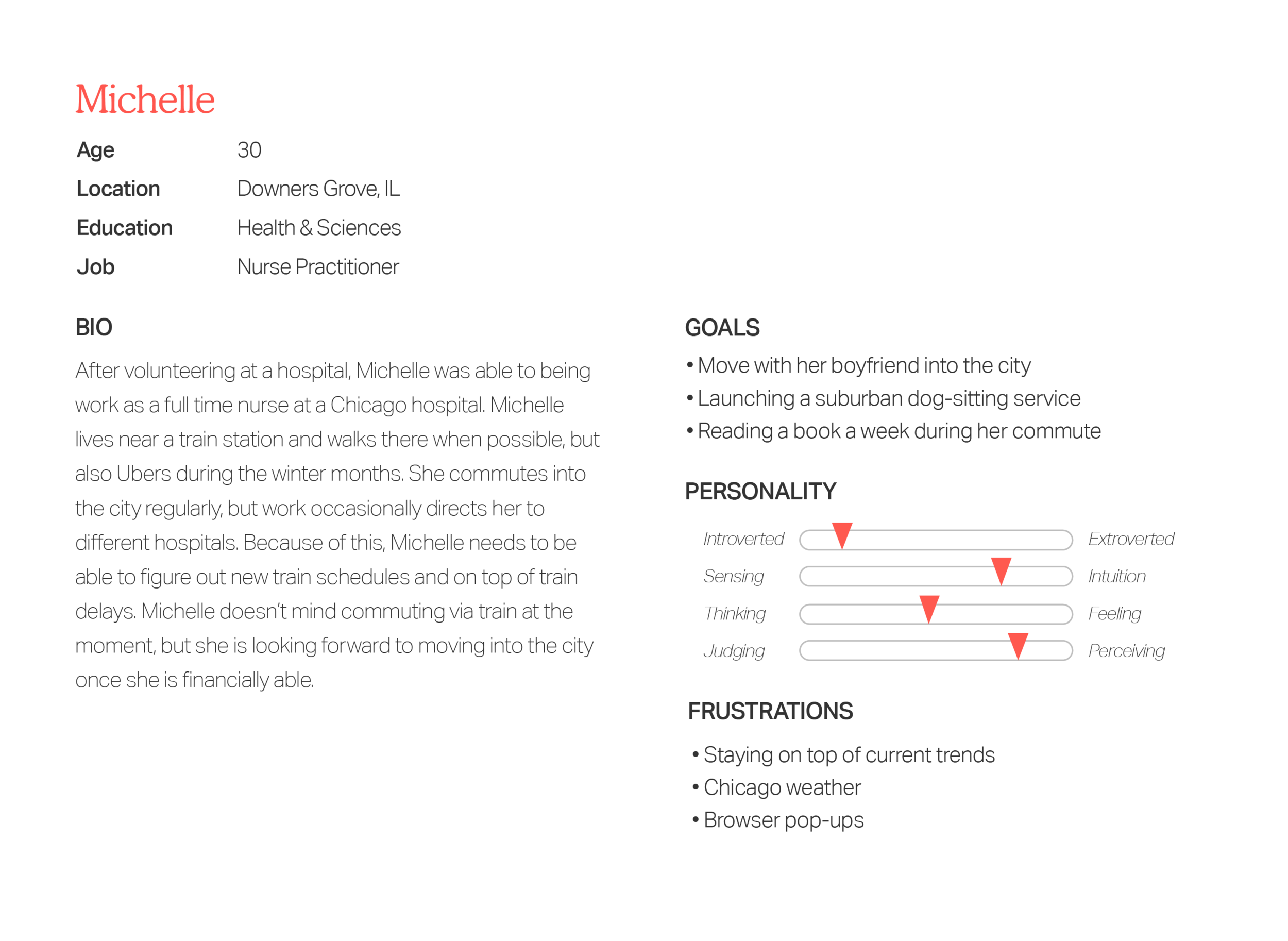
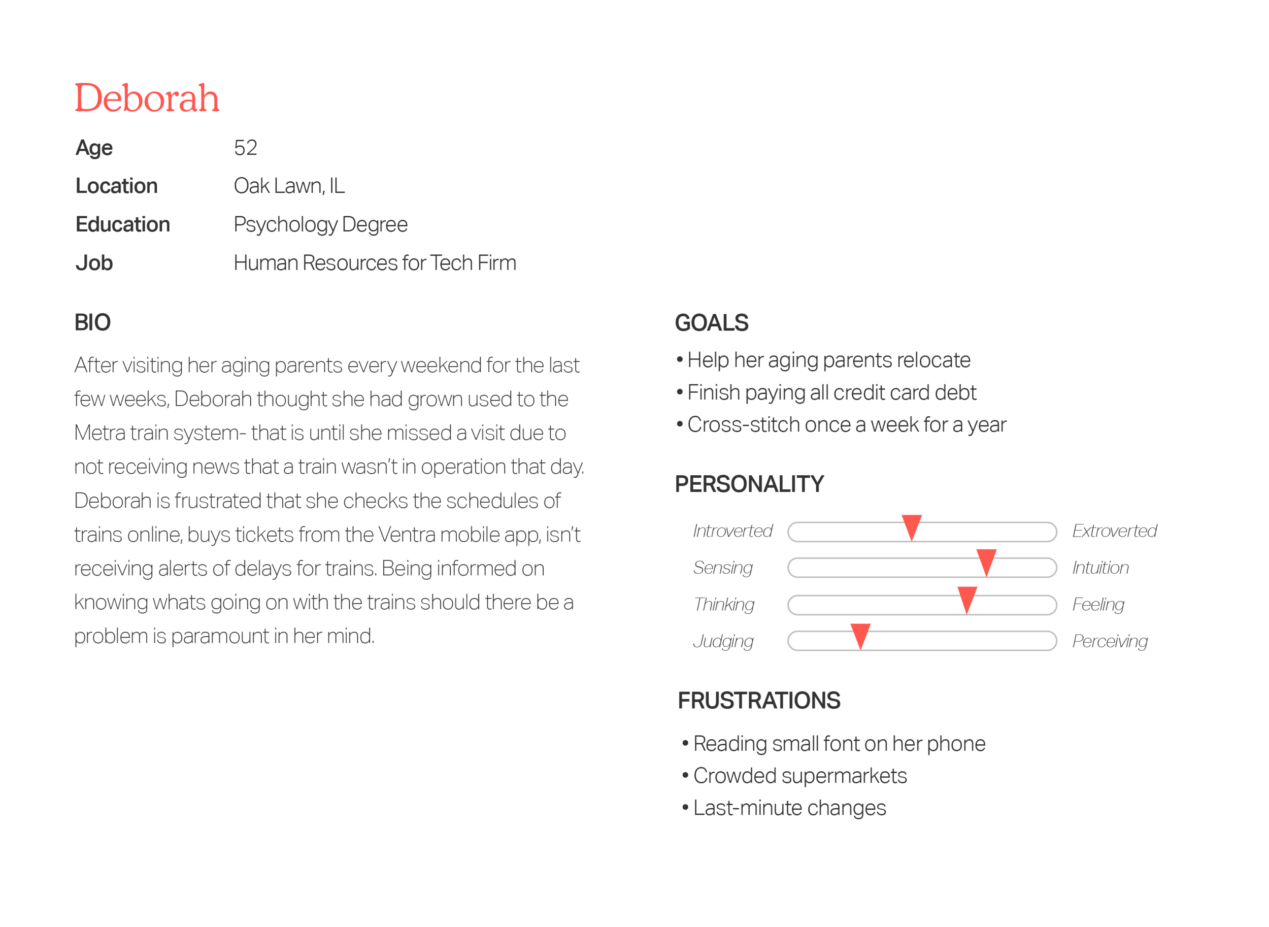
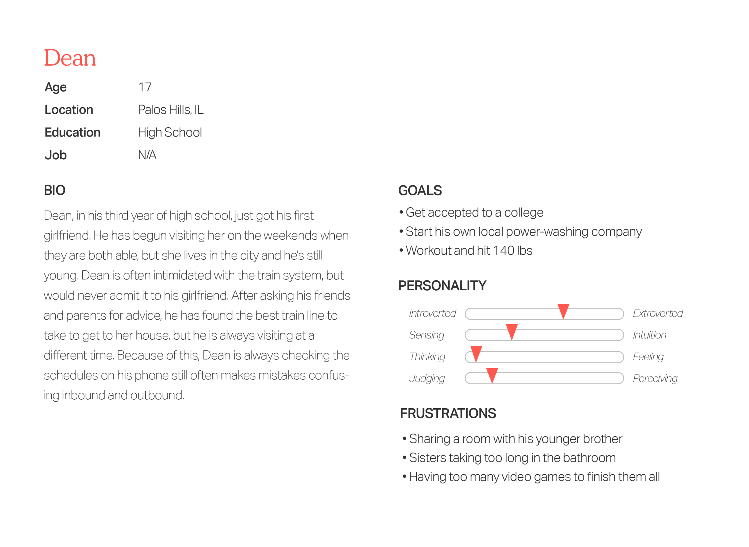
Because many common users of the trains and those surveyed belong to the older population of users, I needed to be sure to carefully involve their concerns and needs by keeping the app simple and intuitive to navigate. One factor independent of age of experience riding was to have a quick access to the train schedules and purchasing tickets. With this, I began sketching how the makeup of the app could look like.
INITAL SKETCHING

USER FLOW

As I mapped out the screens and thought about how the user would navigate the app, I focused on keeping and the most commonly used features in the forefront. Quick access to schedules, purchasing tickets, relevant alerts, and a graceful way to link your preexisting Ventra card to the app were paramount in my decision making.
EARLY WIREFRAME

WIREFRAME

User Testing
Inital Prototype
With an initial prototype of the app, I had three users give me feedback on the app’s early navigation and features.


““Having my location on did help me find the nearest station, but that in practice didn’t work because it’s not the station that will get me to Chicago on time””
“Having the maps show you which lines cover which areas while you scroll is helpful because I’m a visual person, but only when I’m not sure which line to take. I think most people would know which line they need to take usually.”
“I don’t often take the train, but it is what I take when I need to get into the city because driving in the city- if you aren’t used to it- can be a nightmare. Having the app guide you through the right line, schedules, and purchasing of the ticket was easy. ”
This feedback was critical to help understand how the user will actually interact with the app. I removed the Location services and decided to let the user input their Home Station and suggest previous stations when selecting instead.
User Experience
Emotion Mapping
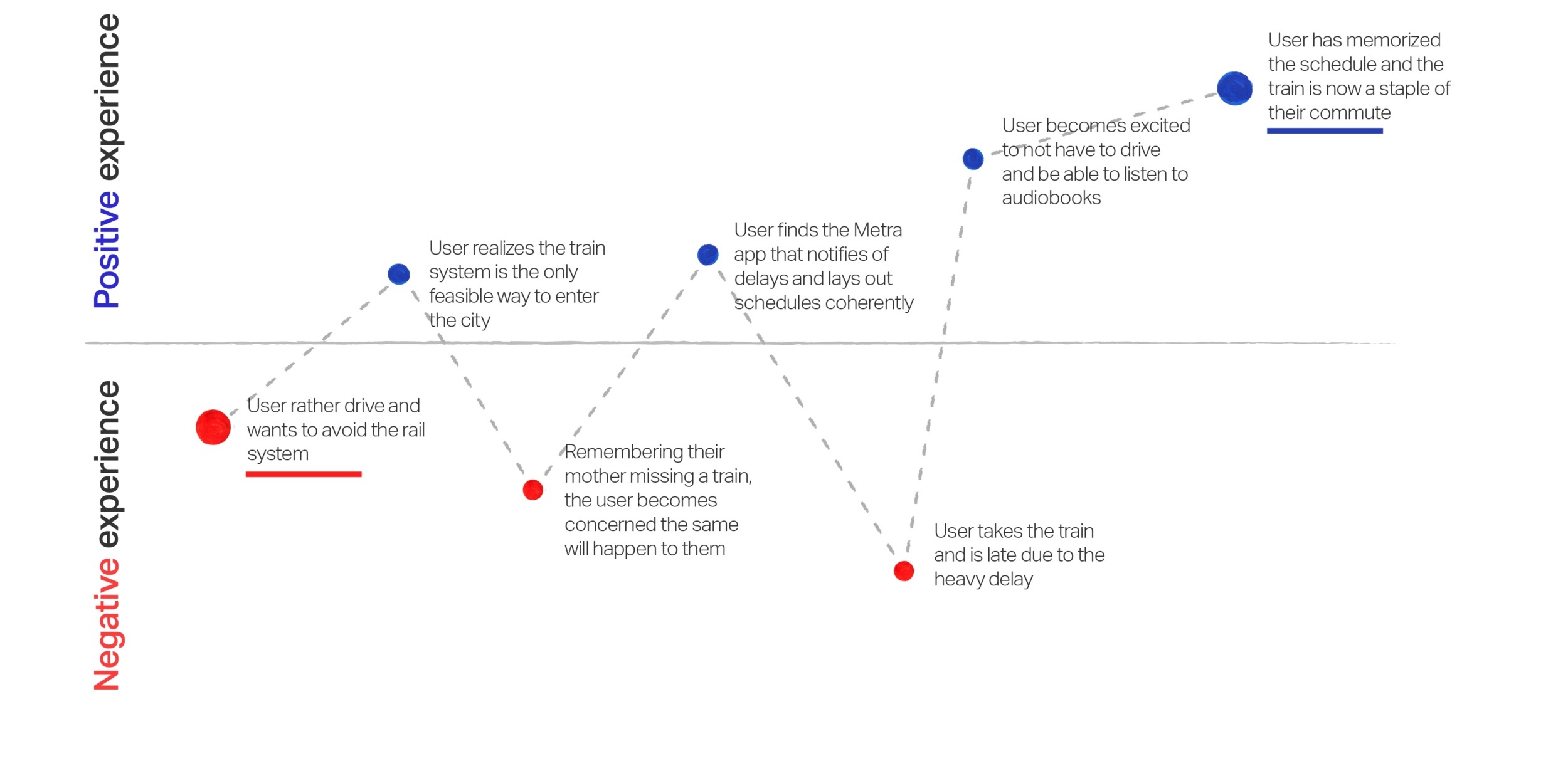
After researching the target audience of the Metra rail system, I was able to carve out a scenario of how a user would adapt to the different features of an app and how they might feel emotionally to the experience.
UX Strategy

HIGH-FIDELITY WIREFRAME

HEURISTIC FOCUS

Comparison
Logo
Metra’s current logo is certainly a product of its time- angular and obtuse. To keep the Metra seeming inviting and simple to ride, I wanted the soft edges to be welcoming and the italic motion to convey swift travels to help represent the brands values.

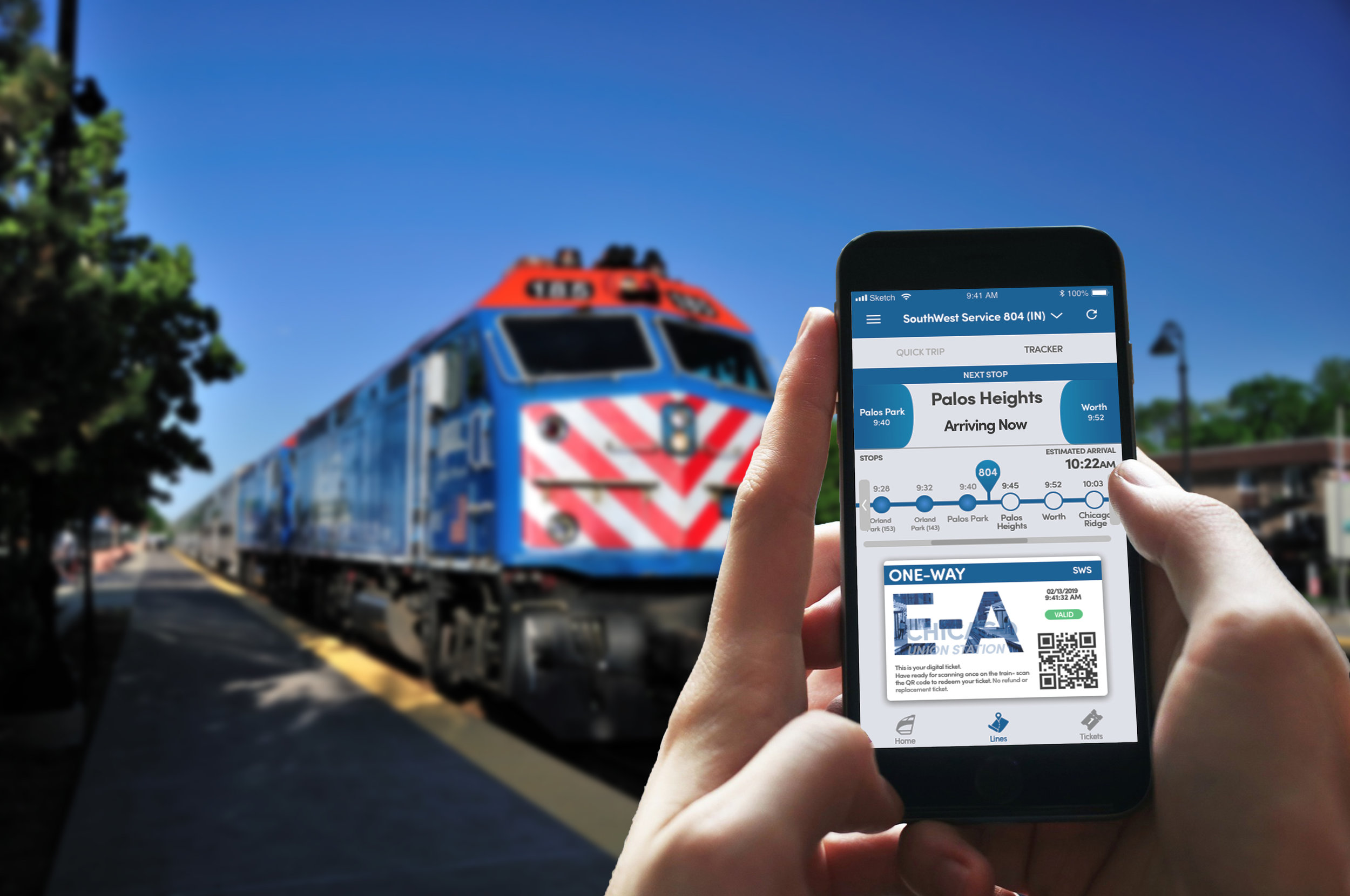
Tracker
The original apps tracker left a lot to be desired- it would tell you where the train was effectively, but that was mostly it for the onTime app. My research indicated it was important to have both your train tracker and ticket in a similar place considering the quick pace of boarding a train and scanning your ticket. As a Metra rider myself, I’ve watched enough people fumble with their phones to flash their digital tickets long enough to realize that this needed to be addressed in a Metra redesign.
Schedules
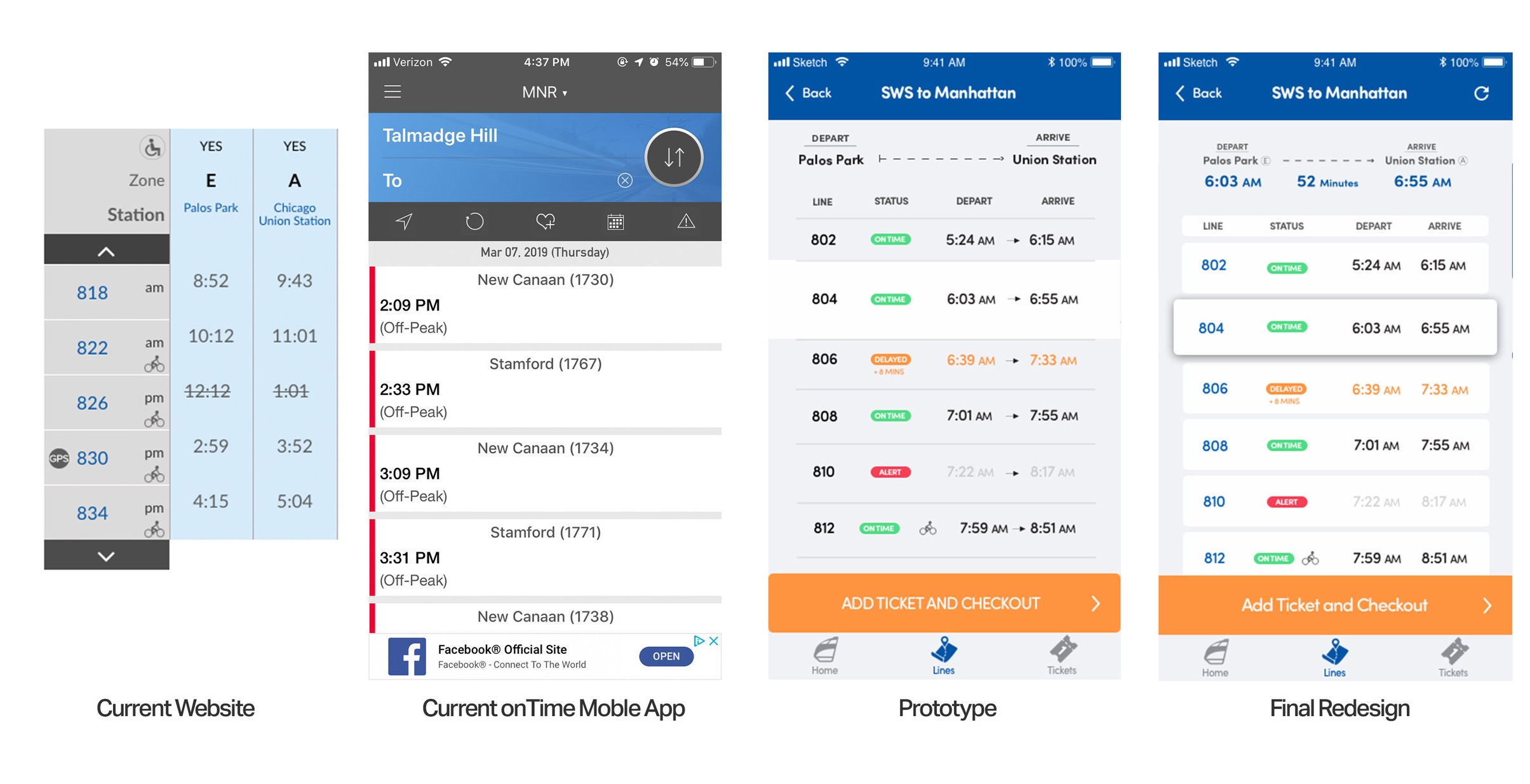
Metra’s current online schedule diagram is nothing short of confusing, considering text blocks don’t line up, the scrolling is clunky, and it doesn’t alert the user of real-time alerts or delays. In the redesign, schedules are cleanly laid out with a heads up on delays, anticipated busy times, as well as critical alerts that would effect the ride.
User Interface
UI Toolkit
The UI elements for the app were as important as the simple structure: I kept advancement buttons large and at the bottom of the screen to promote fast movement between actions. Blue, promoting stability and trust, made a lot of sense for a transportation system millions of people rely on using to get to work every year. Orange accented the interface nicely, and the light grey was used to help give depth between input fields and buttons. Sofia Pro and Sofia Pro Soft have a soft roundness that distances itself from Metra existing harsh logo and presence while remaining legible for a large audience.